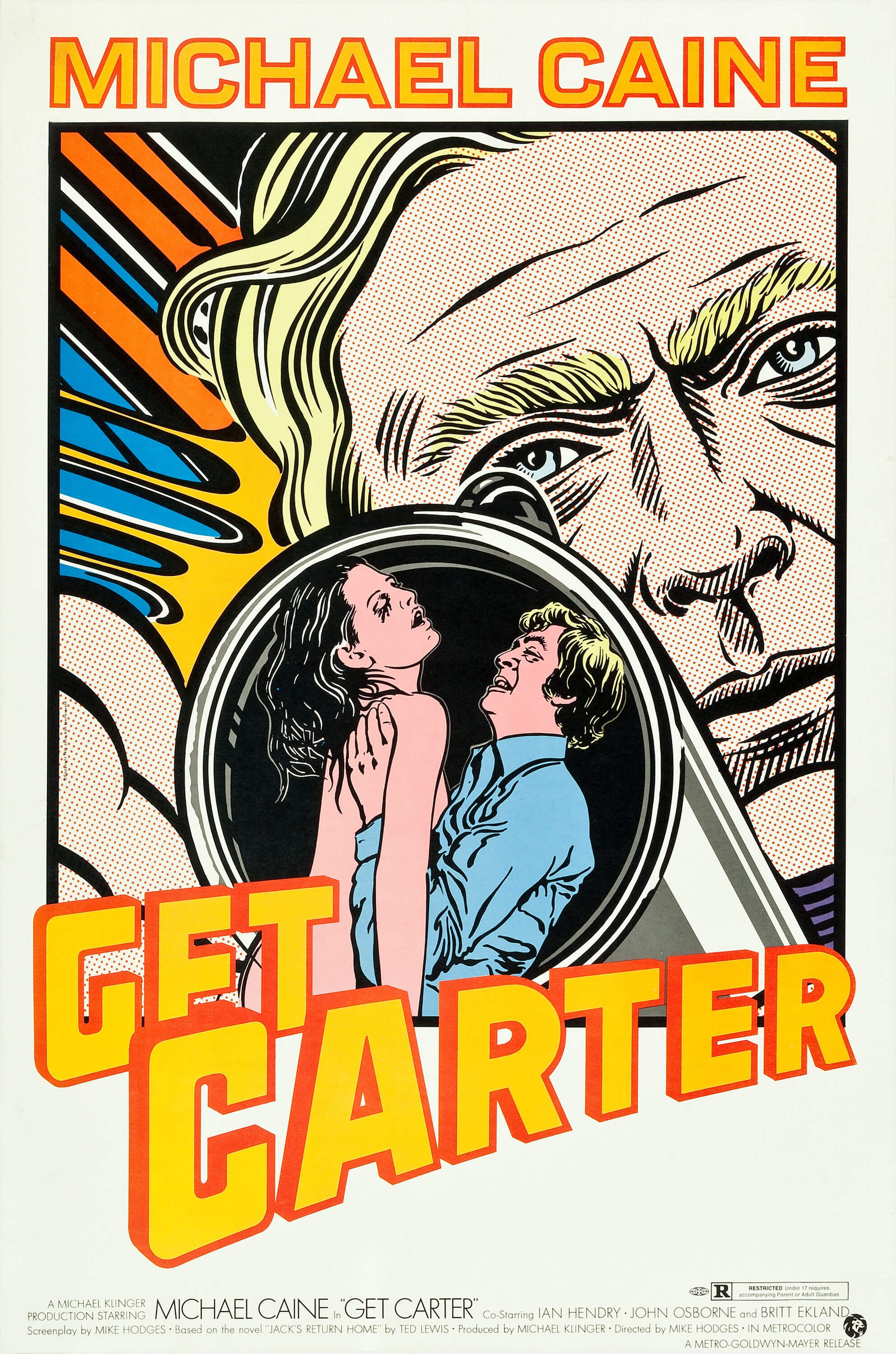
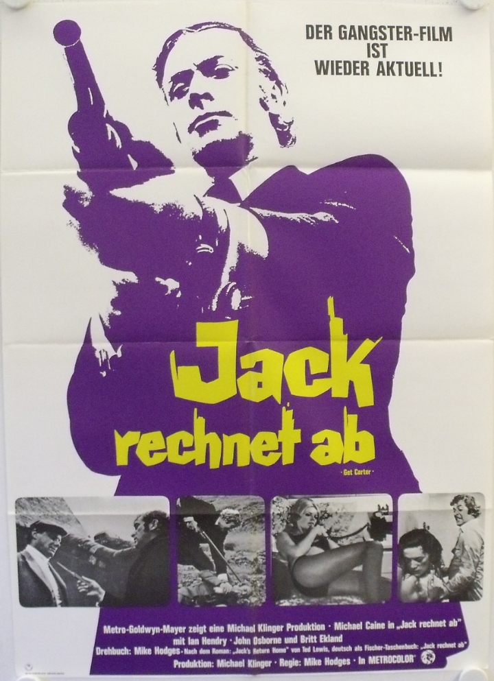
The iconography of the Get Carter not only transcended itself through the music and film, but also the promotional posters that accompanied it’s release. The image of Jack Carter holding his shotgun facing downwards into the camera is arguably one of the most evocative in British cinema. A worldwide release also ensured that the Carter brand was interpreted across the globe. There is a very mixed bag of official promotional posters, both in terms of concept and delivery, all containing the unmistakable imagery carried over from the film to one degree or another.
Below is a selection of the worldwide releases.
United Kingdom
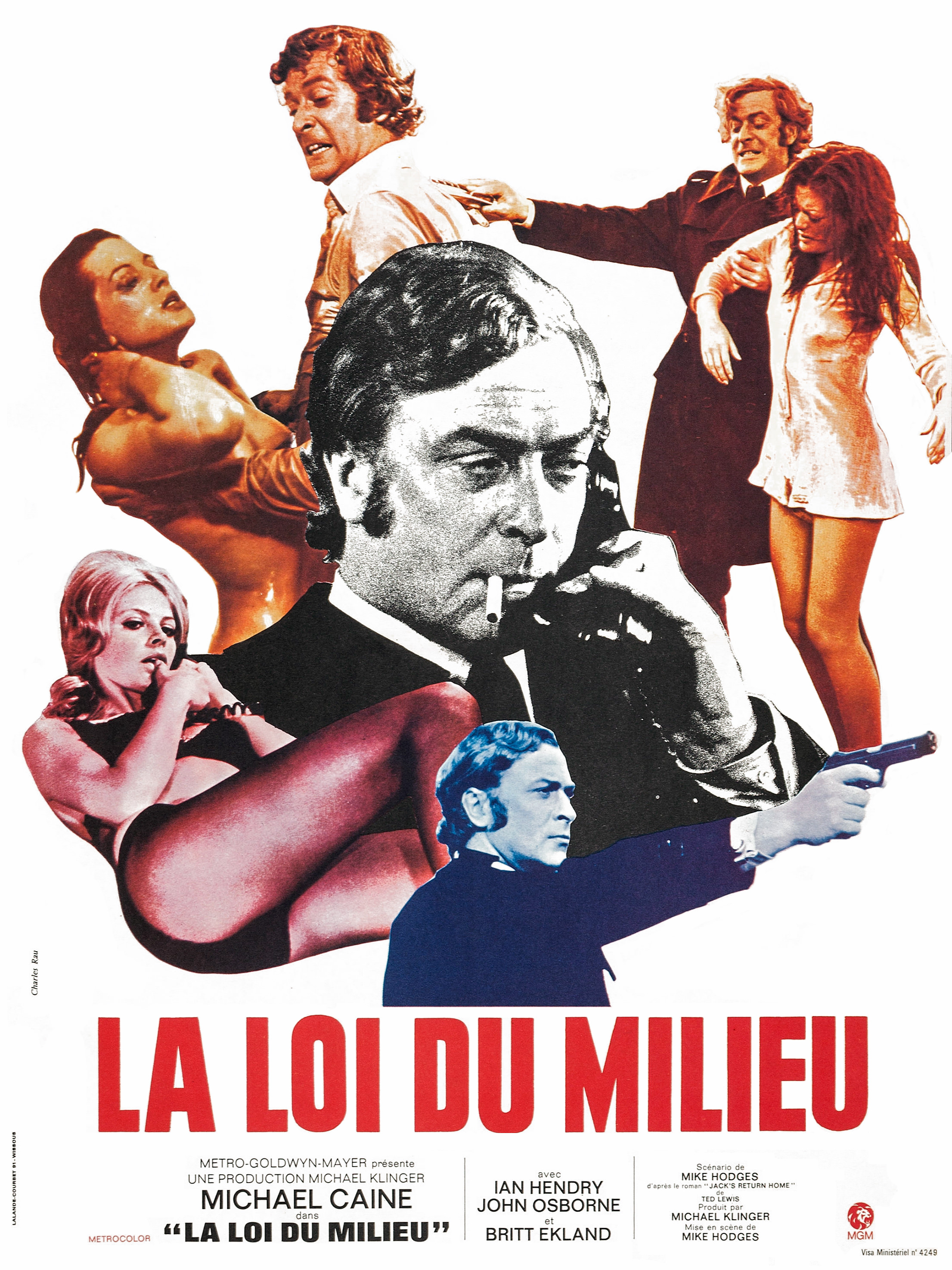
The UK probably fared worse than any of the countries when it came to the original movie poster. Frankly, it’s a bit of a mess and in no way carries over the true style and meaning of the film itself.
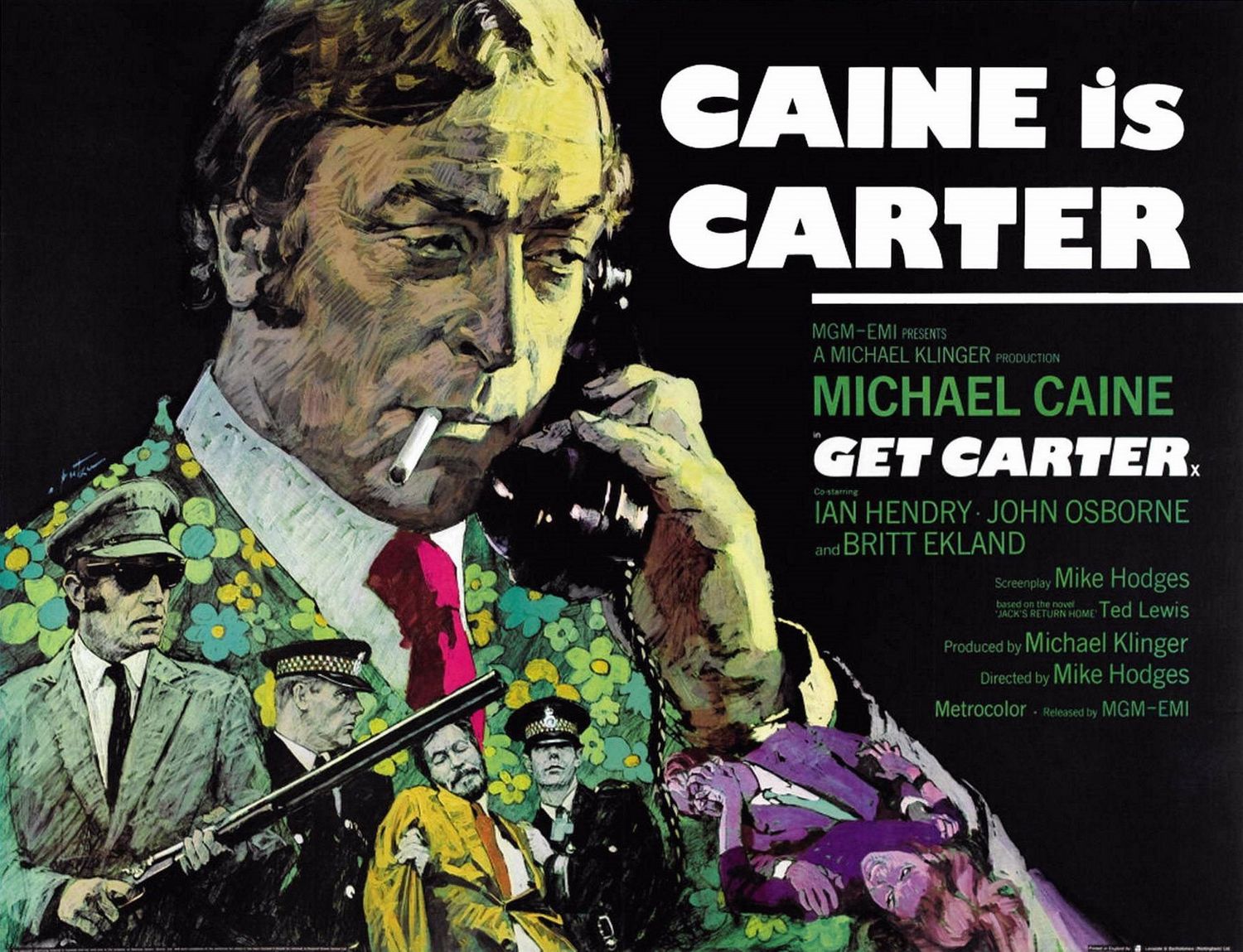
The poster was designed by Arnaldo Putzu, an Italian artist who worked on a number of illustrated movie posters throughout the 50s, 60s and 70s.
The main headline doesn’t actually include the name of the film for some reason. The clear standout issue is the 1960s inspired floral jacket that Carter is wearing. Not only does he not come close to wearing anything remotely similar in the film, these jackets were a good few years out of date even in 1971 (and we never see him in a red tie). Hardly the attire of a professional killer, it’s a look more aligned to the swinging sixties. Why Putzu chose to go with this is a mystery to this day. The associated images are also confusing. We never see Eric holding a shotgun, the scene with Kinnear being escorted out is only shown in the background and the final image of a fight between Carter and an unnamed woman again, doesn’t appear in the film.
This unfortunate image was used for various other releases later on, including the OST and the USA OST (in black and white).
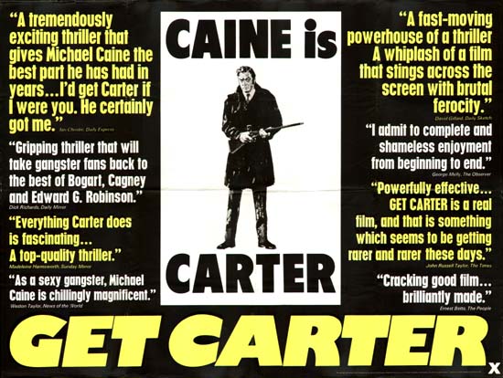
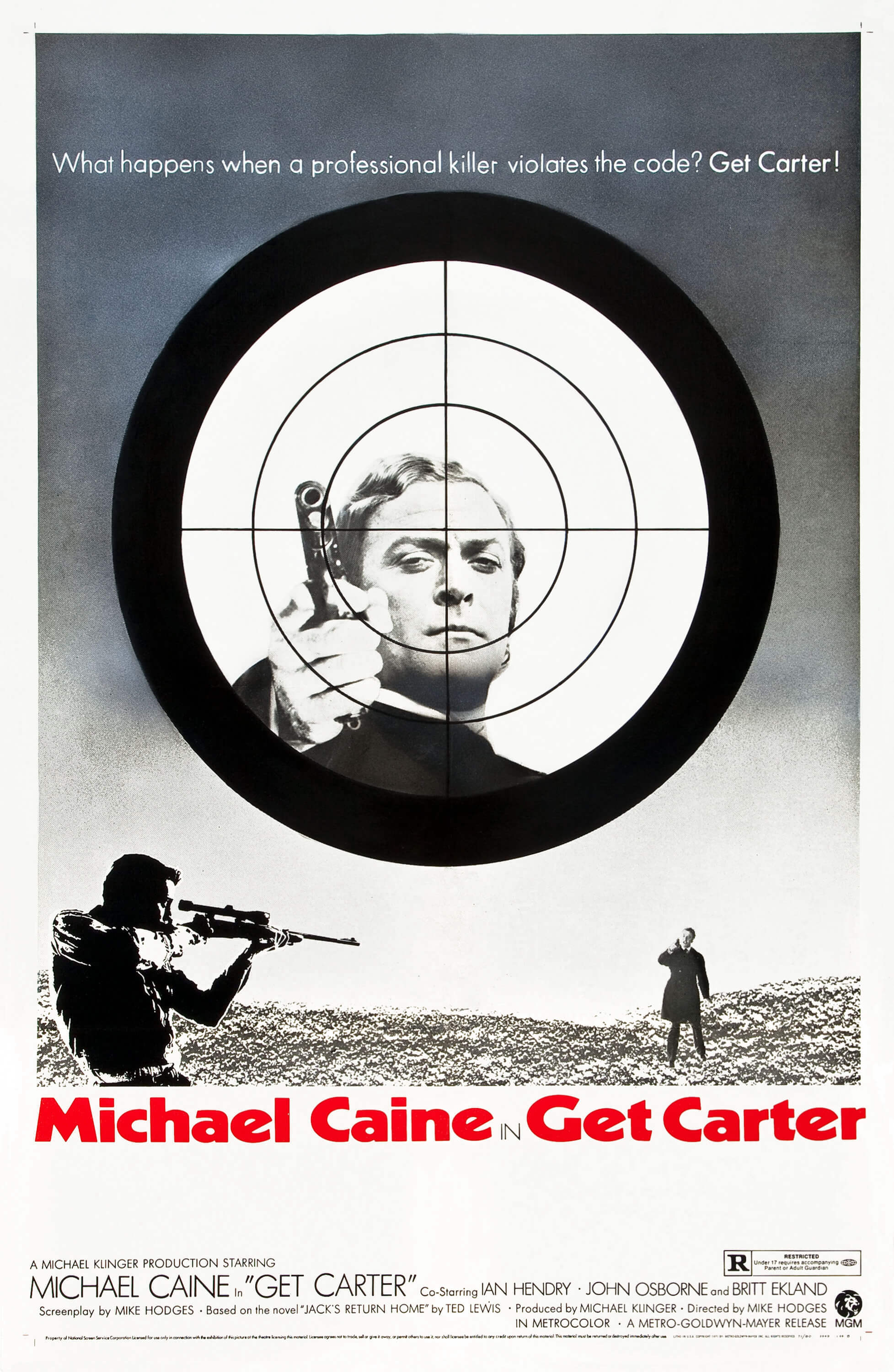
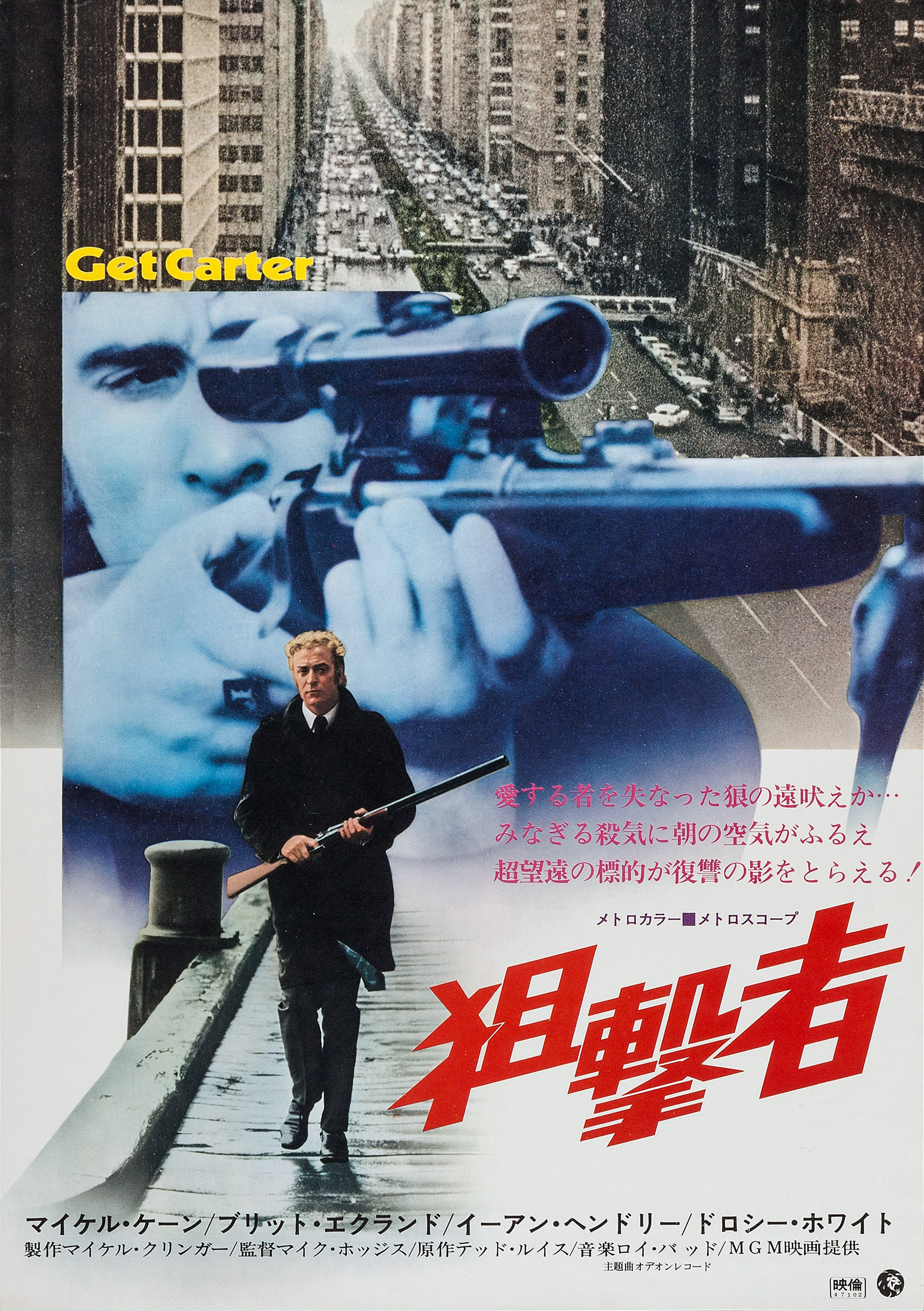
Accompanying the poster was the UK quad sized teaser poster, which thankfully remains true to the imagery of the original film:
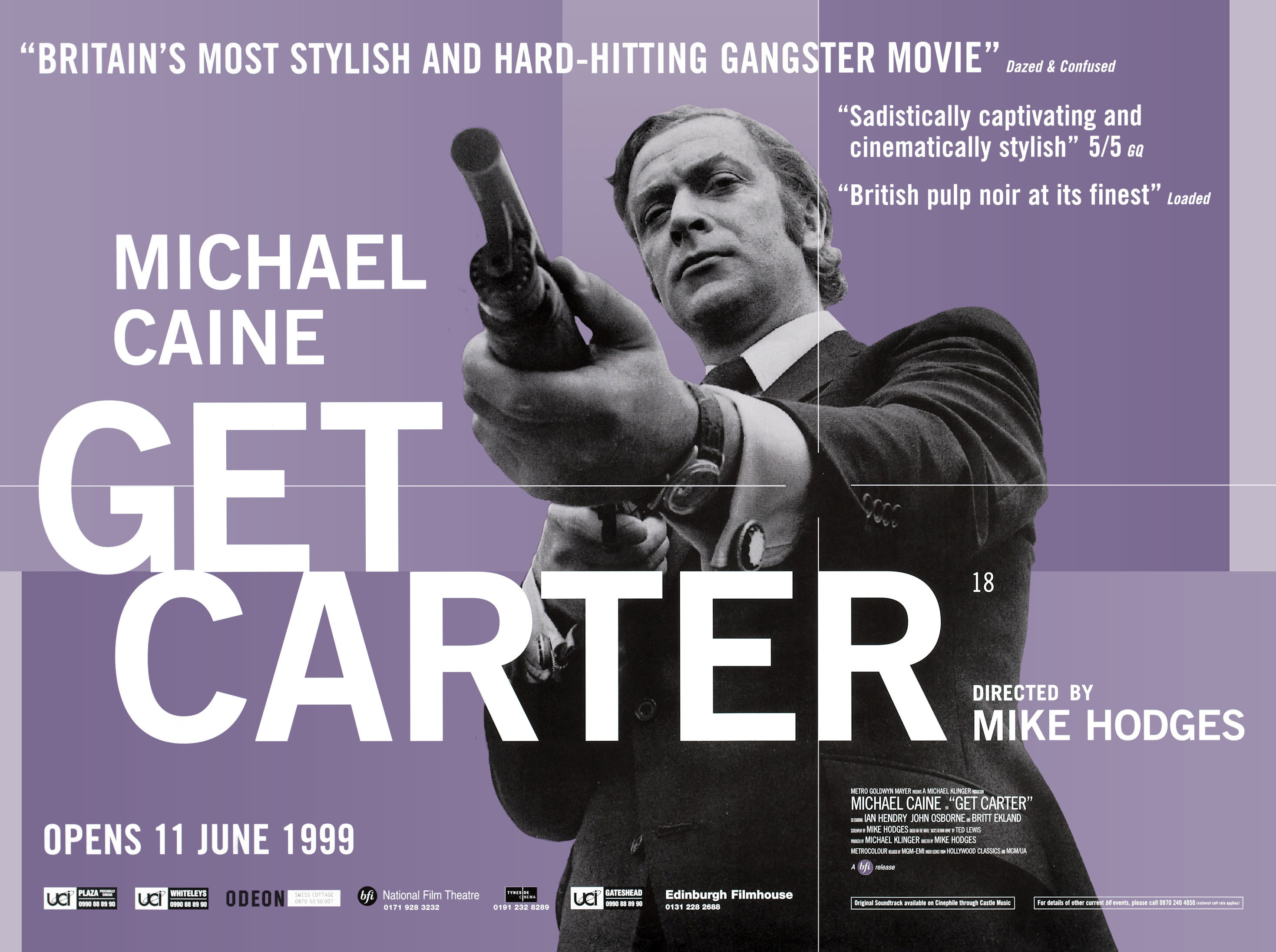
The 1999 rerelease into cinemas corrected the original poor artwork with a basic, but authentic poster:
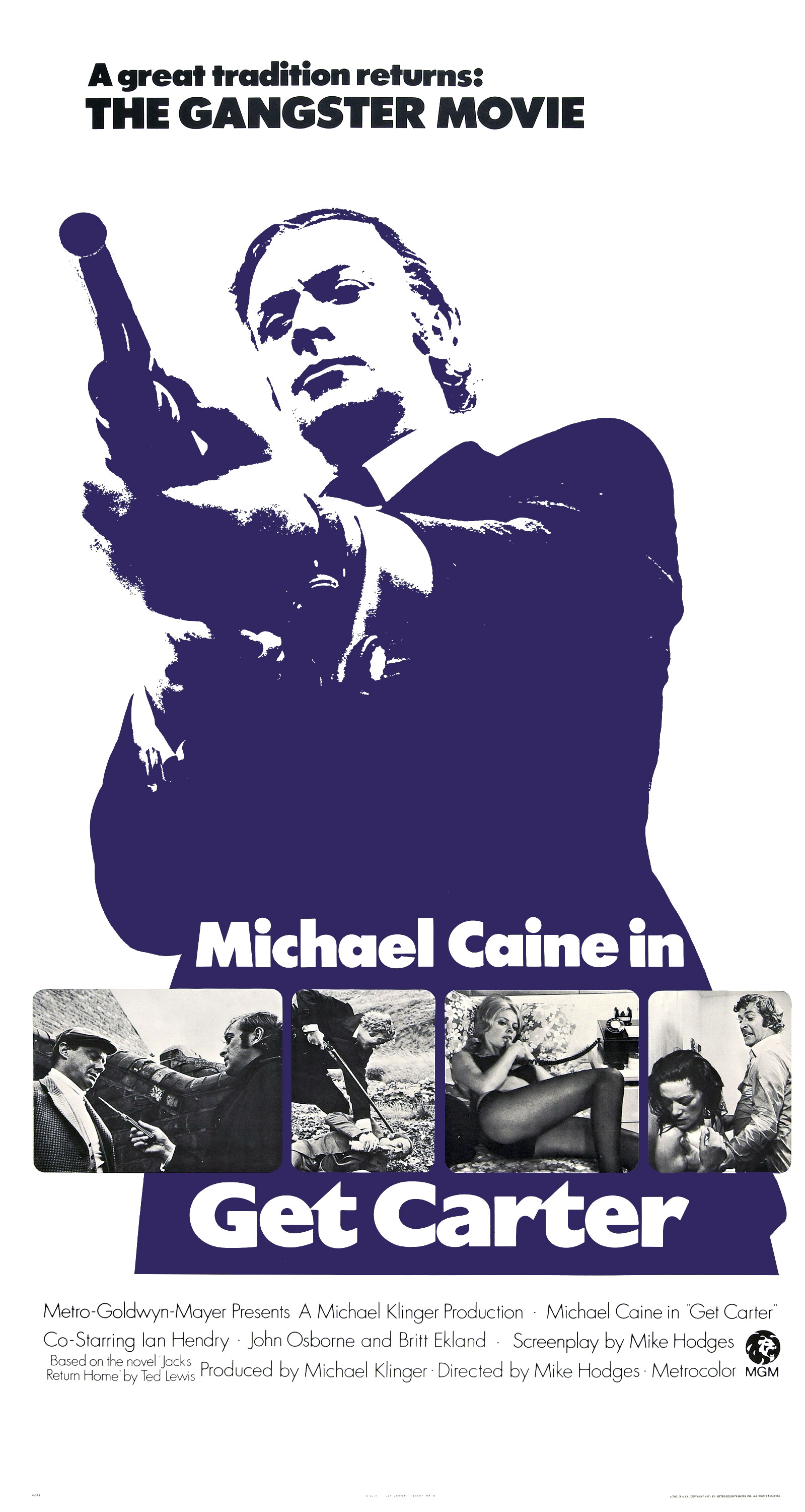
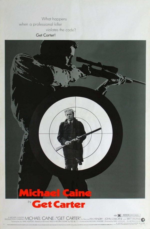
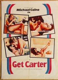
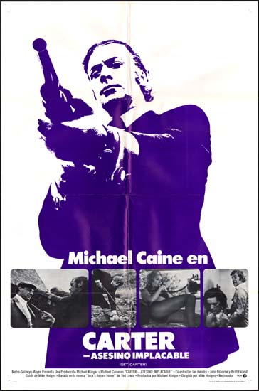
USA
Despite its limited release and lukewarm reception, the artwork that went along with film in the USA proved to be much more accurate of a description of the film itself. Keeping a clean and structured layout, the plotline was probably revealed too much in the two main posters – that said, they provide us with probably some of the better branding that the film has received:
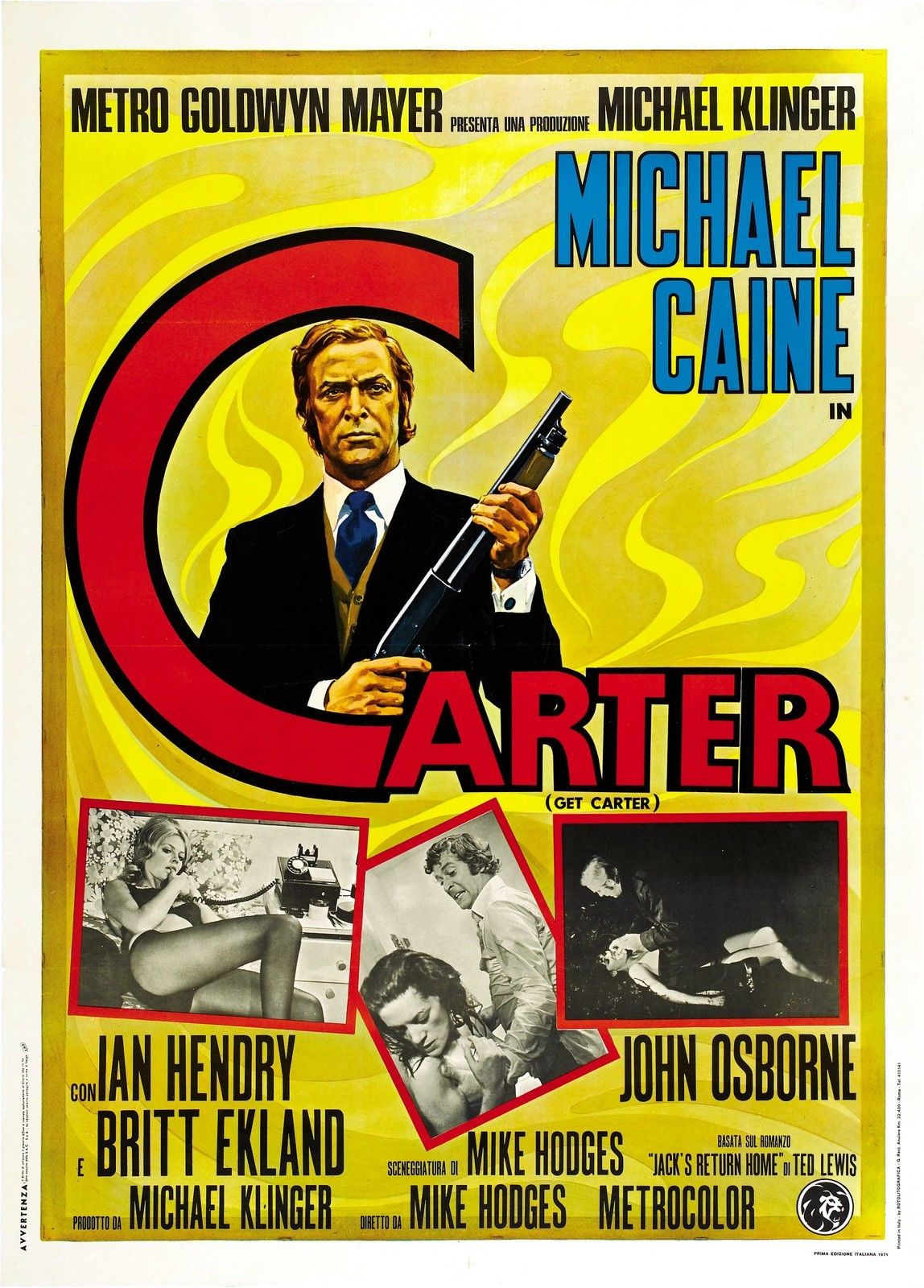
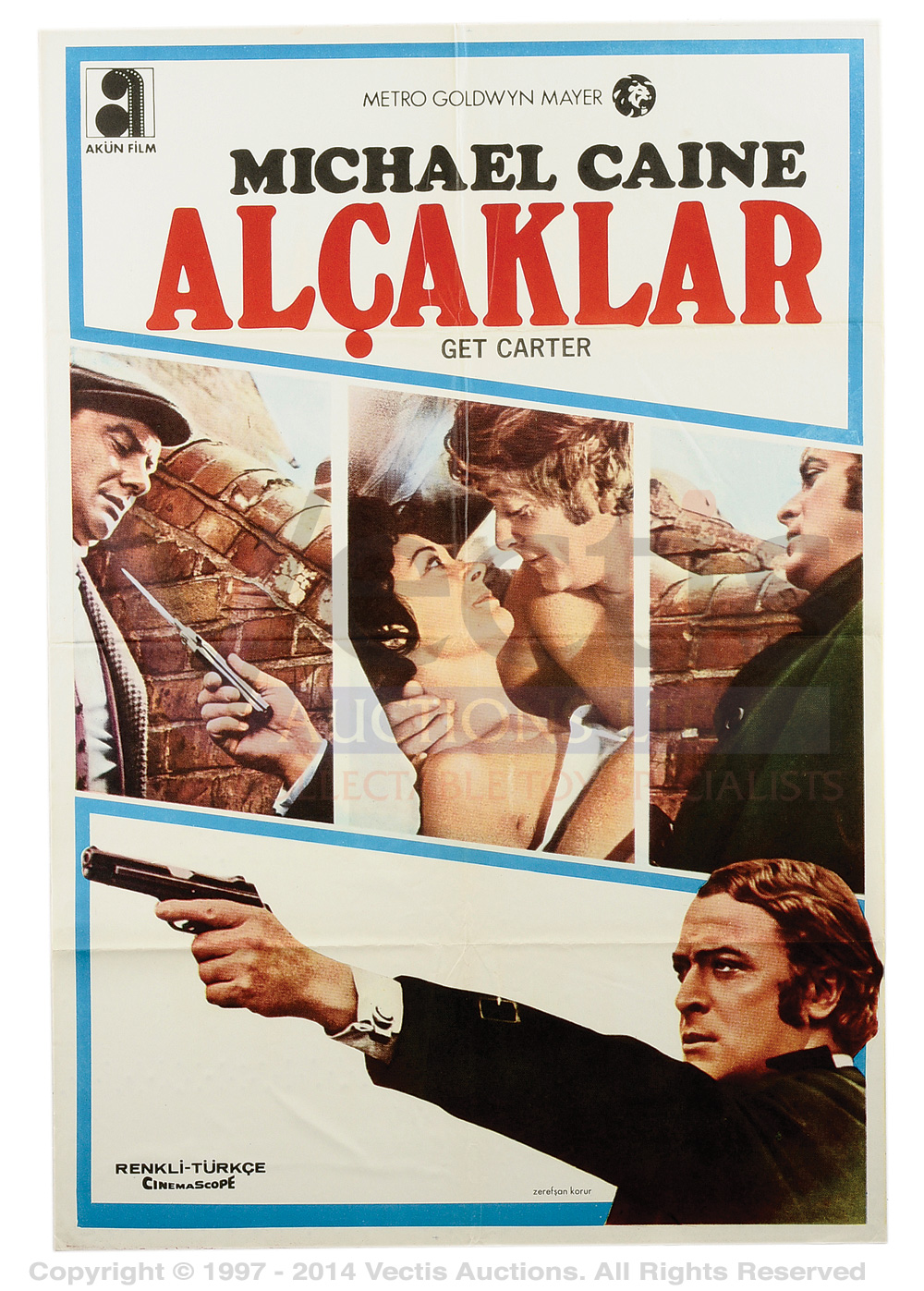
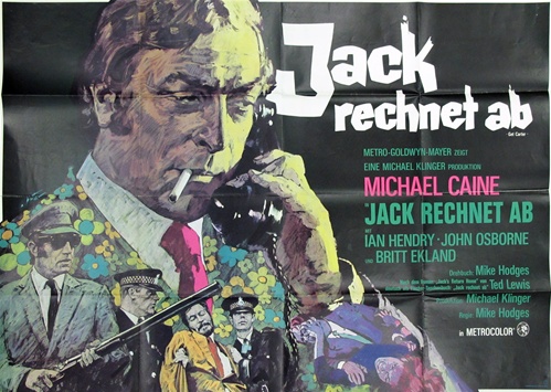
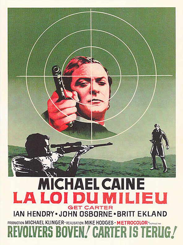
Worldwide
The film was released into most markets in Europe, here is a selection of the posters that accompanied it, presumably created by the local office of the production company:

A good run down of the poster can be found over at mubi.com.
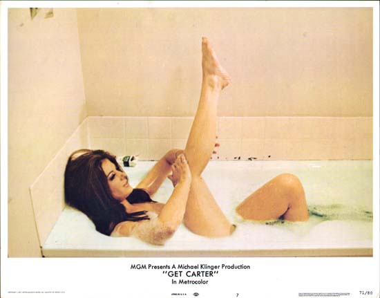
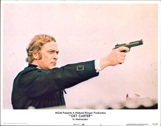
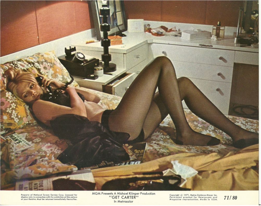
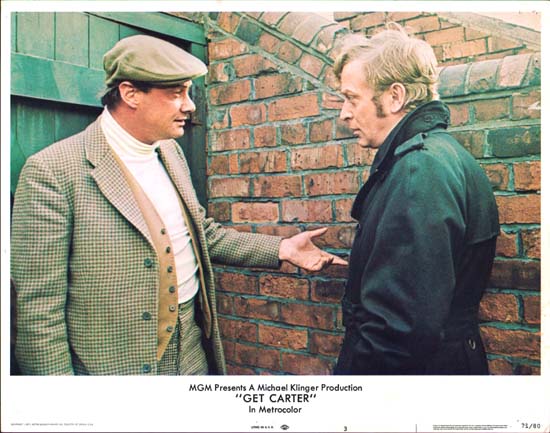
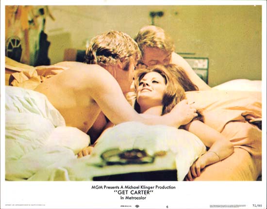
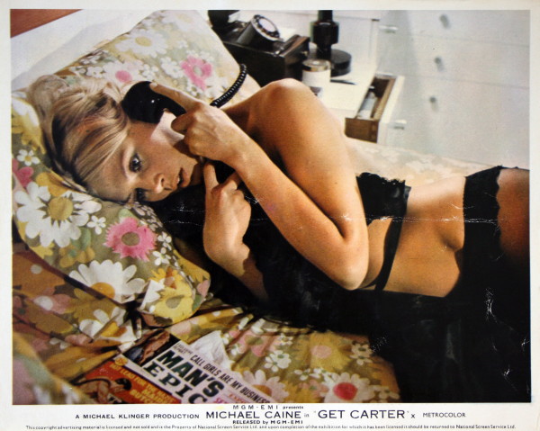
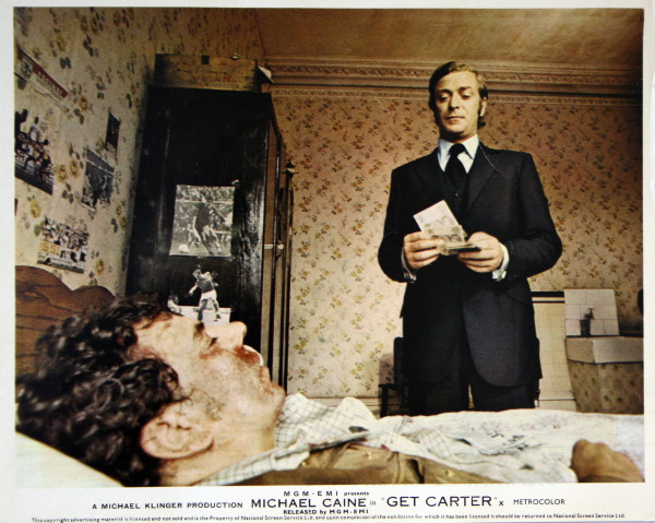
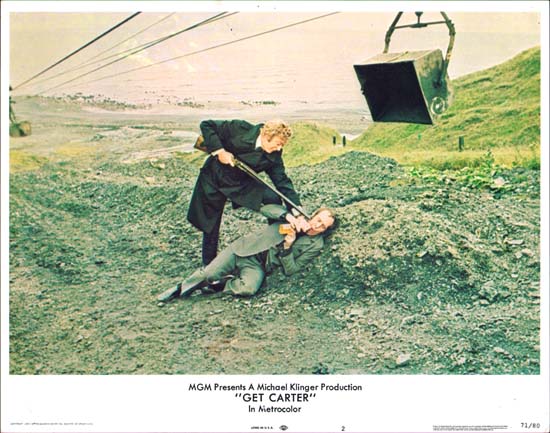
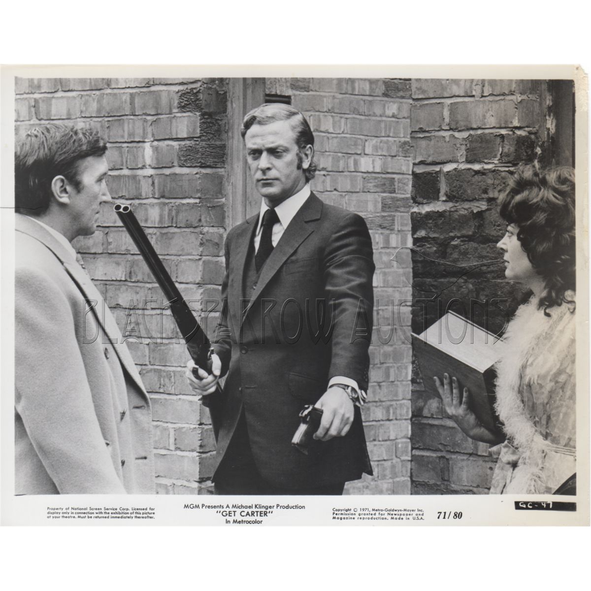
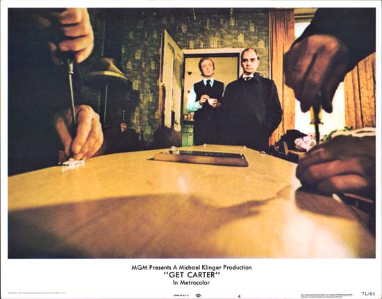
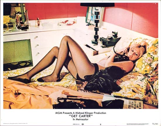
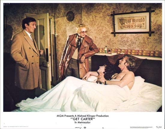
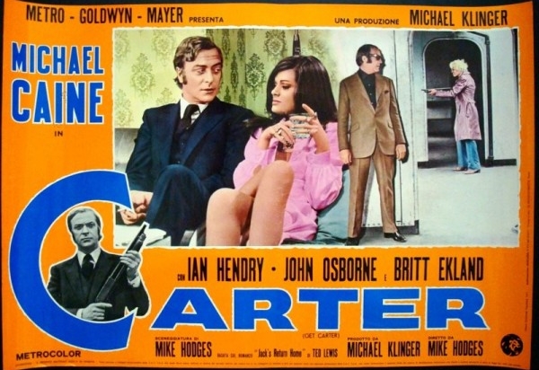
Lobby Cards
As was the fashion at the time, a number of lobby cards were produced for the movie, particularly for the USA market. Typically landscape, 10″x8″ and printed on heavy stock their intention was to briefly summarize the movie in a series of captioned scenes.